
| Art Direction
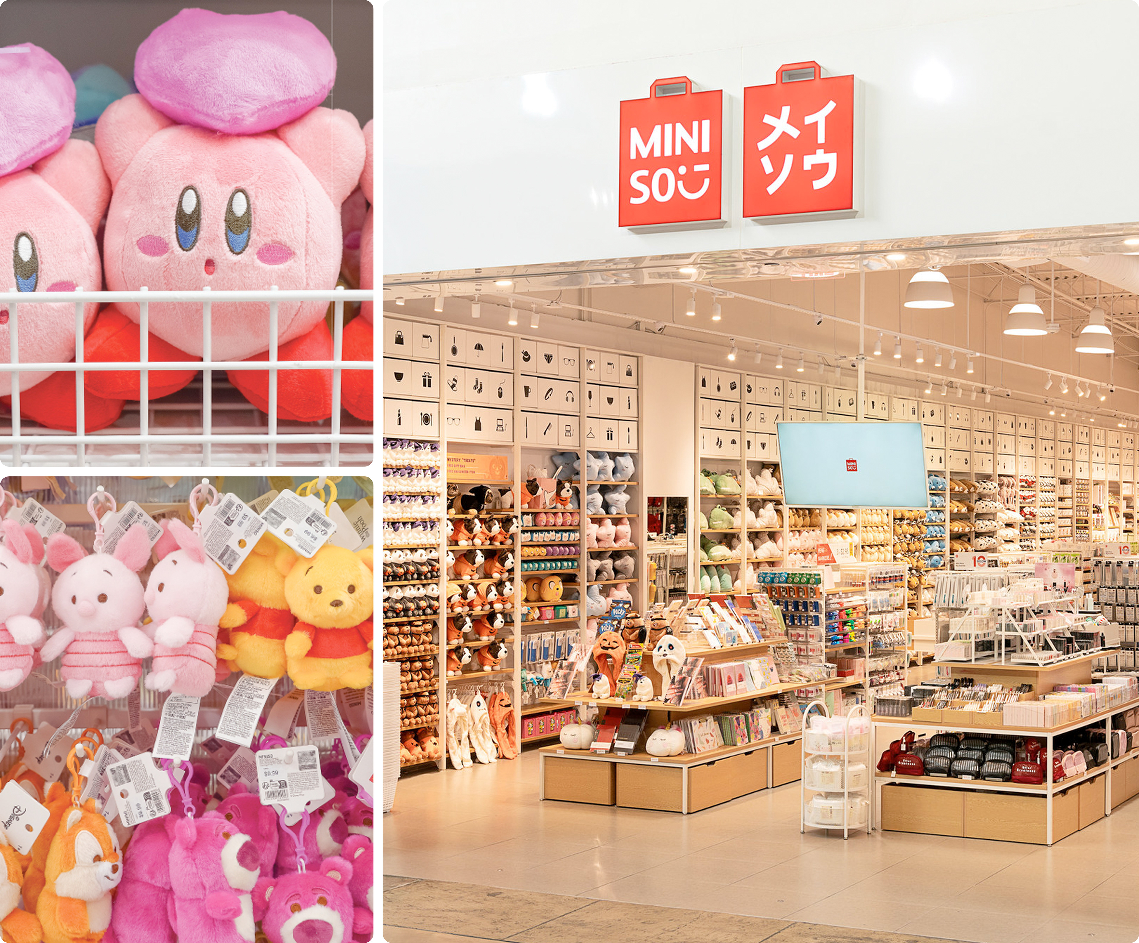
I led creative services for Miniso Canada ™ and oversaw the launch of multiple new locations and new IP's, developing campaigns and promotional systems for one of the fastest-moving retail environments in the market.
Working across digital and in-store channels, I translated Miniso's global visual identity into a multitude of exciting visual campaigns that supported new product launches, ongoing character collaborations, and fresh seasonal promotions.
This included Marvel Studios, Disney, Sanrio, Hello Kitty and Friends, and Barbie IP's.
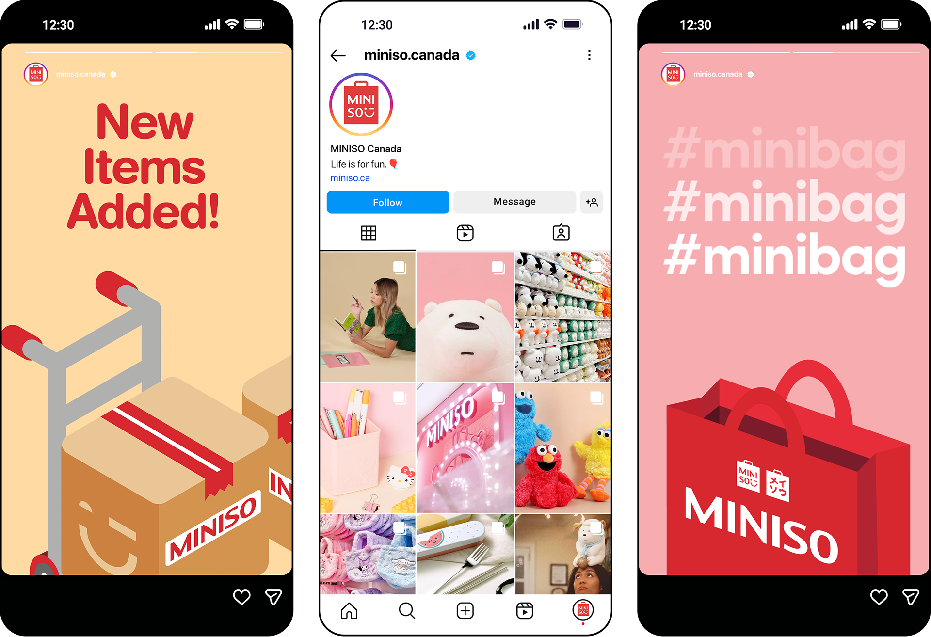
| 'Minibag' National Campaign
The mystery bag format had been building momentum across retail and pop culture for years. The Minibag campaign was MINISO's answer to that cultural moment, and an opportunity to do what the brand does best: turn a shopping trip into an experience worth talking about.
The concept was straightforward in the best possible way. A single bag. A single price. A carefully curated selection of MINISO's highest-rated products and most sought-after licensed IP: items customers already loved, packaged together in a way that made the whole feel worth more than the sum of its parts.
The curation was intentional; a genuine celebration of the brand's strongest offerings, given a format that rewarded loyal customers and drew in new ones.
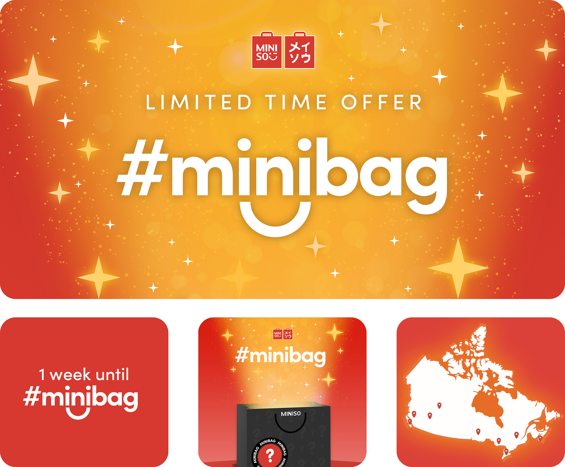
Designed as a one-weekend-only event, deployed simultaneously across every MINISO location in the country. That decision was critical to the creative brief, scarcity and scale working together. The national rollout gave the campaign weight and legitimacy, while the limited window created a genuine sense of urgency that no discount percentage alone could manufacture. The countdown assets, the map of participating locations, the unboxing-ready bag design. Every touchpoint was built to amplify anticipation and drive foot traffic in the days leading up to launch.
The visual identity leaned into warmth, magic, and momentum. A rich amber-to-red gradient, bursting stars, and the hashtag-forward naming convention gave the campaign a social-native energy that felt at home on digital screens and in-store windows alike. The goal was for #minibag to travel. Something customers photographed, shared, and talked about before, during, and after the weekend itself.
It was a huge success for over five years, replicated for various holiday and seasonal iterations.
| 'Star Sellers' National Campaign
The concept centered on a rotating selection of 10 to 20 best-selling products, offered at deeply discounted prices for a limited window. My job was to give that idea a visual identity strong enough to work everywhere at once: in-store signage, shelf displays, digital assets, and national rollout materials.
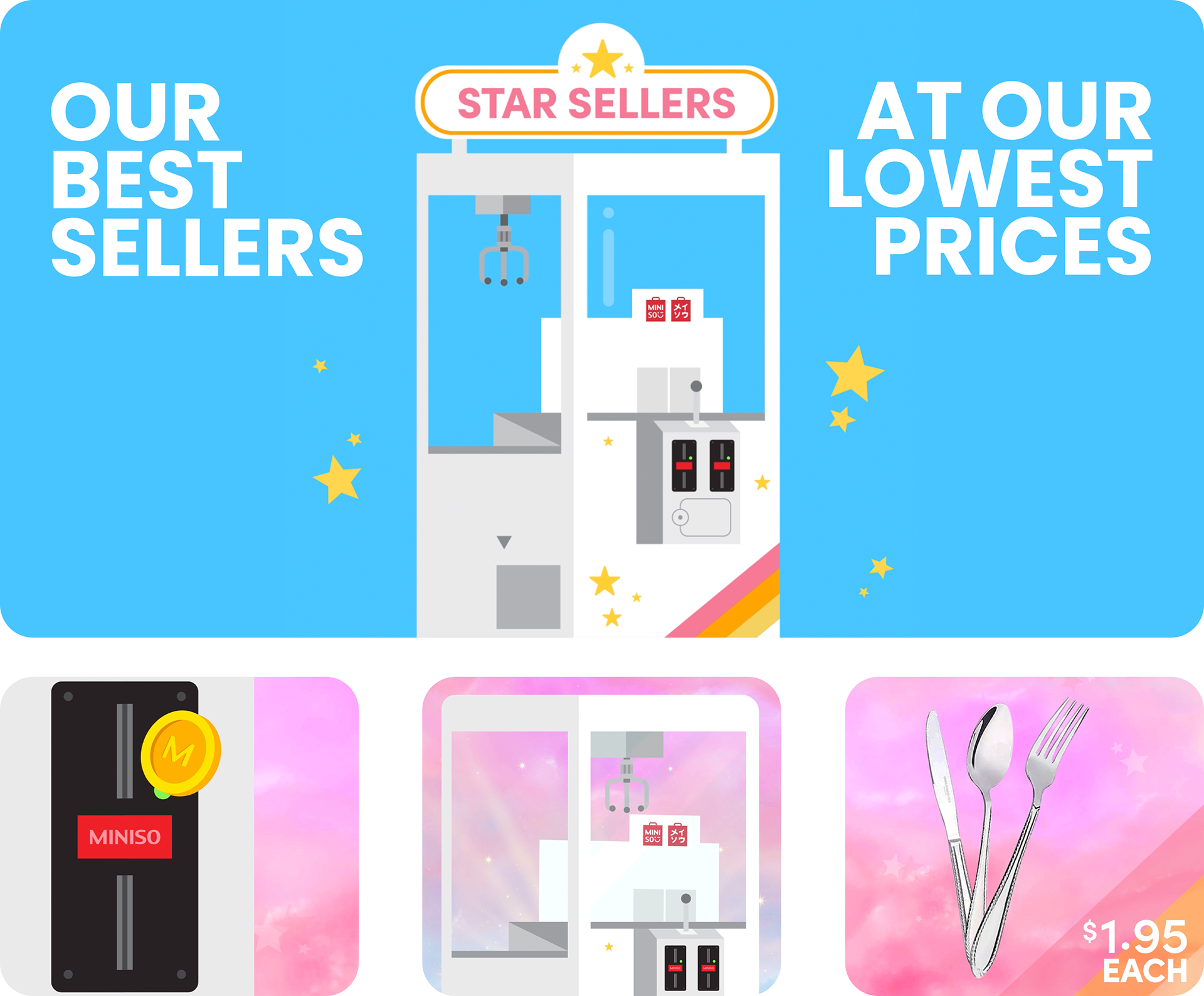
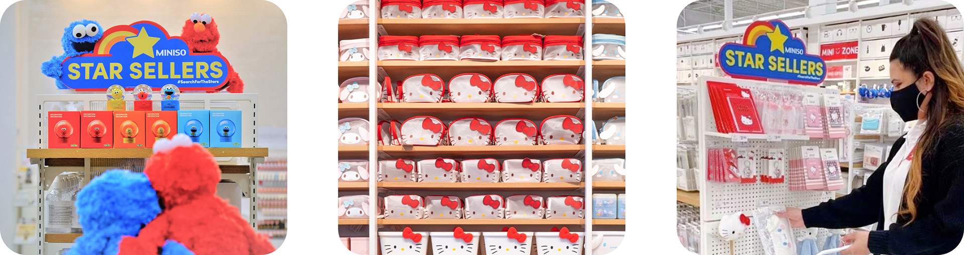
The creative direction leaned into the playful, prize-worthy energy that MINISO's brand is built on. The claw machine became the campaign's visual anchor, a symbol of anticipation, value, and a touch of delight. It communicated the rotating, curated nature of the selection without a single word of explanation. Paired with a bold, high-contrast colour palette and oversized typography, the campaign felt less like a discount promotion and more like something worth seeking out in store.
From large-format in-store displays and branded shelf fixtures to animated digital assets designed to travel across channels. Every element was designed to be immediately recognizable as Star Sellers, whether a customer encountered it at the end of an aisle or scrolling past it on their phone.
The results validated the concept decisively. Analytics showed a sales lift of over 30% across every featured product, with some items reaching as high as 80%.
Star Sellers resonated so strongly with shoppers that it earned something rare for a promotional program: permanence. A dedicated corner of shelf real estate was allocated to it across locations for years following the initial launch, making it one of the most enduring and commercially impactful campaigns I've had the opportunity to build from the ground up.
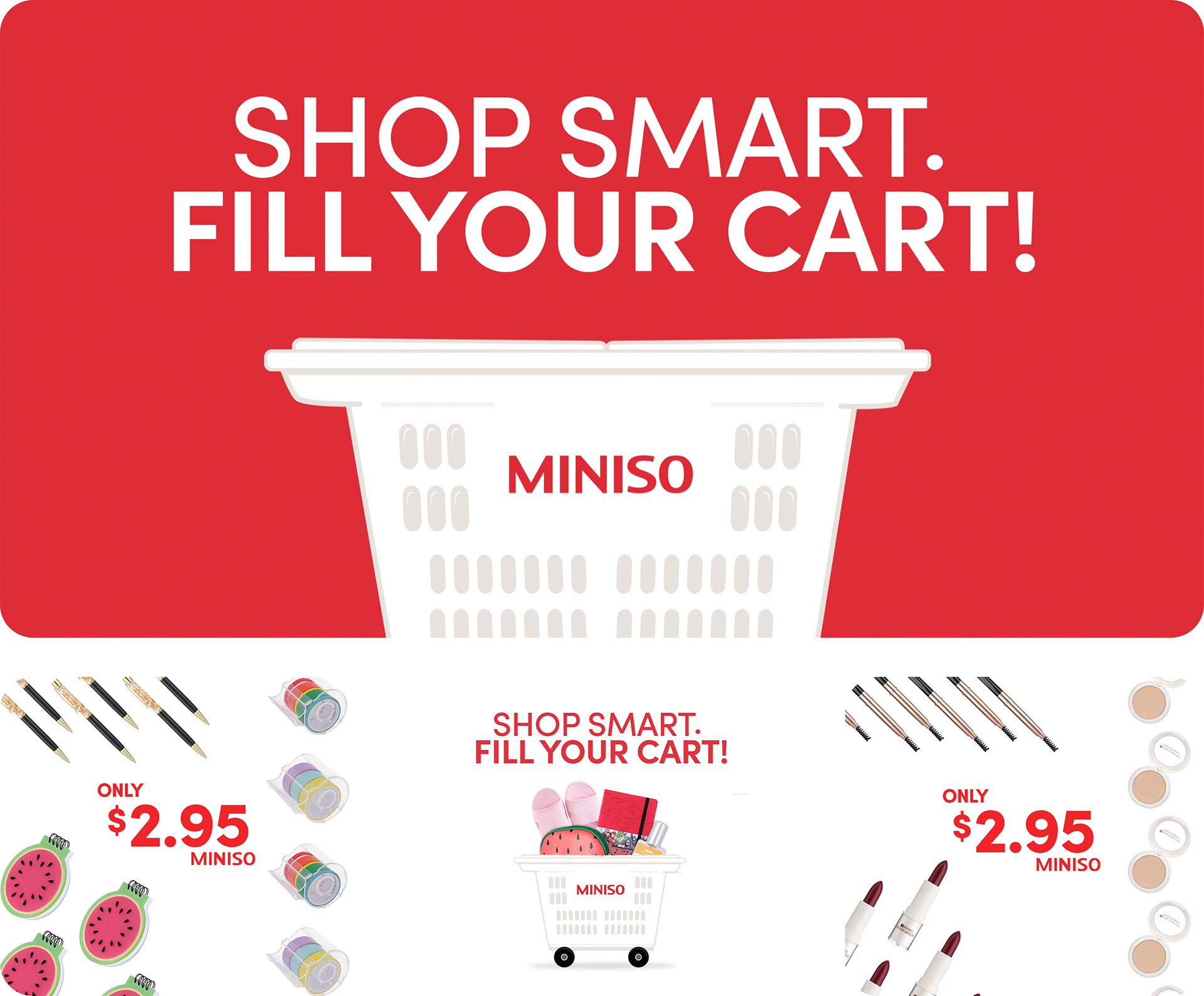
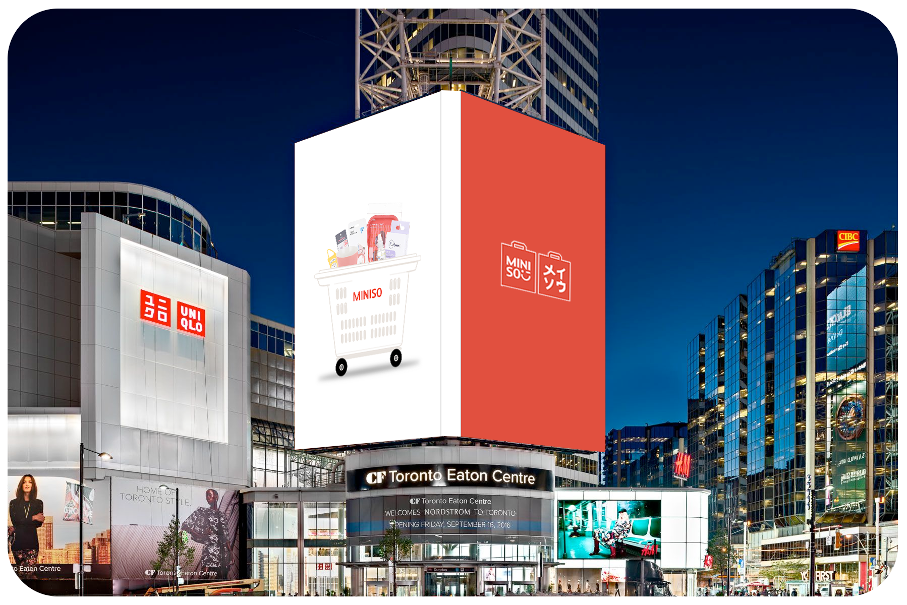
| 'Shop Smart' National Campaign
One of MINISO's most compelling brand truths is the sheer volume of quality products available at a single low price point. The 'Shop Smart' campaign was built to make that truth impossible to ignore. The creative brief called for something that could communicate abundance, value, and momentum all at once. It was key that it could hold its own on the largest screens in the country.
The answer was exciting motion and clear value. I developed a pattern-driven animation that leaned into the visual rhythm of product after product after product; each one dropping into a cart, each one priced at the same low amount.
The campaign was designed for scale from the start. The hero placement was Yonge-Dundas Square in Toronto: one of the highest-traffic outdoor advertising locations in Canada.
That context shaped every creative decision. The typography needed to read from a distance. The motion needed to be legible at speed, for a pedestrian catching a three-second glance as much as for someone stopped at a light. The result was enough to command attention in one of the most visually competitive environments in the country, while staying true to the warmth and playfulness that defines the MINISO brand.
The 'cart' image and symbol became key to the MINISO Canada brand and its marketing materials and assets for many years.
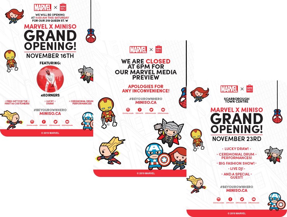
| Marvel Exclusive Grand Opening
When MINISO Canada launched its exclusive Marvel x MINISO location at Vaughan Mills, the brief called for an event worthy of the IP and an audience that takes this universe seriously. What followed was one of the most ambitious activations I've ever led.
The event drew over 2,500 people in attendance, a turnout that spoke to both the strength of the IP and the effectiveness of the promotional campaign built around it. The opening featured a live dragon and drum performance, a fashion show, a DJ, and a lucky draw: all activations designed to turn a store launch into a full cultural event.
High-profile guests including Tori Webster, Dani Roche, and Roz & Mocha added further reach and media visibility, extending the footprint of the event well beyond the doors of the store itself.
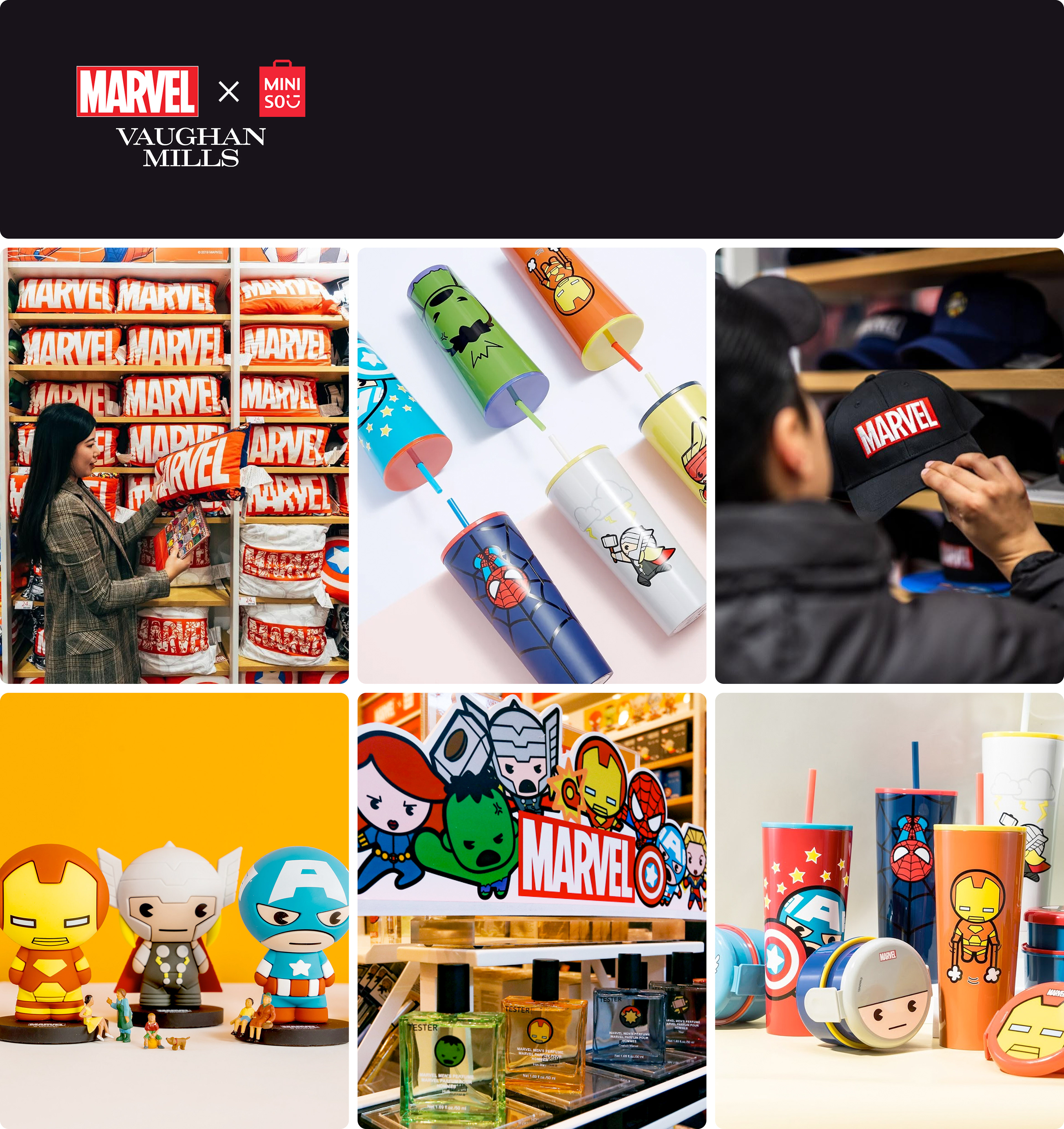
Multiple location openings followed, each requiring its own tailored print materials such as grand opening posters, media preview notices, and in-store signage. All produced to the same standard and adapted for each specific venue.
The Vaughan Mills opening set a benchmark for what a MINISO grand opening could look and feel like, and the subsequent rollout across additional locations proved that the creative framework was built to scale.
| Social Media Content
I developed and executed an ongoing social media content system designed for consistency and flexibility. I oversaw and executed this content, ensuring the MINISO Canada social presence was fresh and unique while remaining aligned to the core brand.
All content was designed to function seamlessly across organic and paid channels.