
| Art Direction
Insalata came to market with a bright bold look but a clear identity problem that a lot of new dispensaries face: how to stand out on street corners when your product category is fighting choice saturation in a market full of fresh competition?
The answer: a 'fresh take' on cannabis.
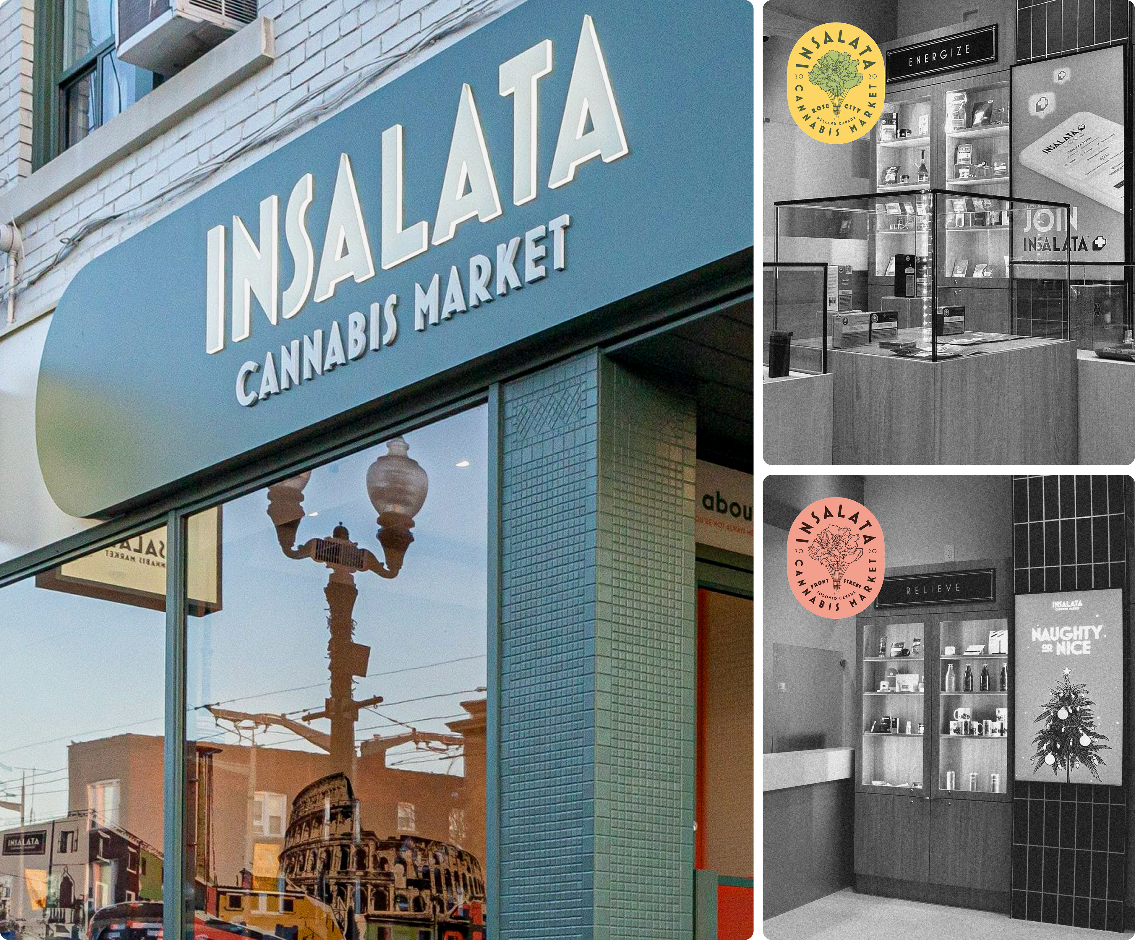
I led the full creative direction and execution for all four of Insalata Market locations across a multi-year period of location expansions, membership growth, and sales growth. Scaling from a single flagship location into a renowned name in Ontario dispensaries.
Operating as the primary creative partner and art director, I developed and managed the brand’s visual identity, shaped the customer in-store experience, and relaunched the loyalty membership program with a fresh new look.
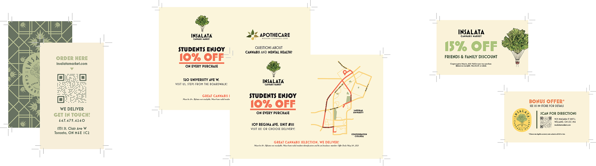
| Traditional Print Materials & Signage
Working within the strict regulatory guidelines of both provincial and federal bodies, we quickly determined that our approach for the public would be stricter and more formalized than that of the in-store customer experience.
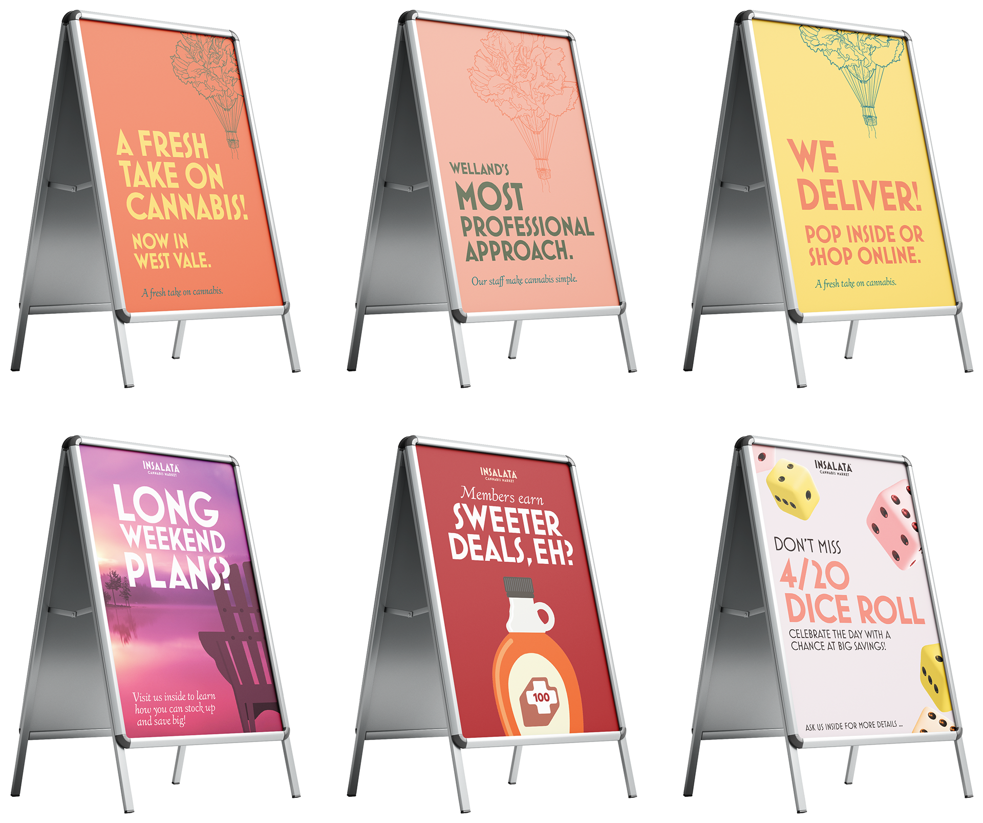
Thus, our a-frame signage campaigns shown here became an essential and cyclical element to amplifying our in-store promotions and seasonal events. Though limited by said guidelines, each board maintained strong visual presence and personality. We began to see this boundary as an opportunity and positioned our messaging to provoke intrigue and lead conversation.
We harmonized this signage to extensive print collateral. Flyers, discount postcards, delivery maps, and a variety of supporting promotional coupons and other assets.
All built, aligned, and supported by the core visual system and guideline.
| In-store Digital Signage
Often overlooked in retail cannabis, digital signage proved to be valuable real estate across Insalata’s locations. While customers waited, dizzied by endless scrolling SKU lists and product clutter, we took the opposite approach. Our screens provided clarity and increased engagement, transforming an idle (and often confusing) wait time into a meaningful touchpoint.
Whether the approach was educational, seasonal, or promotional. Each was designed within a consistent visual language, one that demonstrated to an ongoing dialogue we'd have with each customer at each purchase or product pick-up.
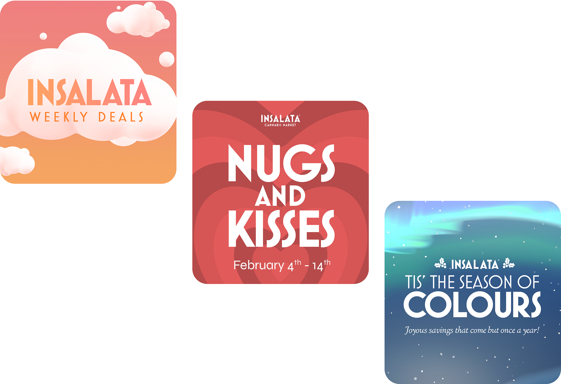
| Weekly Deals Concept
The weekly deals system showcased a real operational problem: how could we communicate rotating product promotions at scale, across multiple locations, without sacrificing visual quality and importance?
To solve this, I developed a high-impact framework designed for a weekly cadence. This system allowed for rapid product rotation while keeping the digital and physical menus "fresh" for returning customers.
Bright, colourful, and deal-focused presentation that shifted weekly ensured that promotions never felt stagnant or overlooked. Each screen isolated an individual SKU, removing "menu noise" and placing the product in a premium spotlight. High-visibility badges made the consumer's "win" immediate and undeniable, reducing cognitive friction at the point of sale.
This exciting visual direction transformed standard price cuts into curated "events," leading to a measurable shift in consumer behaviour and inventory velocity. Featured SKUs saw a sustained sales increase on average of 15–20% across all locations. The modular design also allowed for mid-week pivots to address location-specific stock levels, effectively clearing inventory bottlenecks through visual prioritization.
Leading to a higher average basket size as customers engaged more deeply with the featured selection.
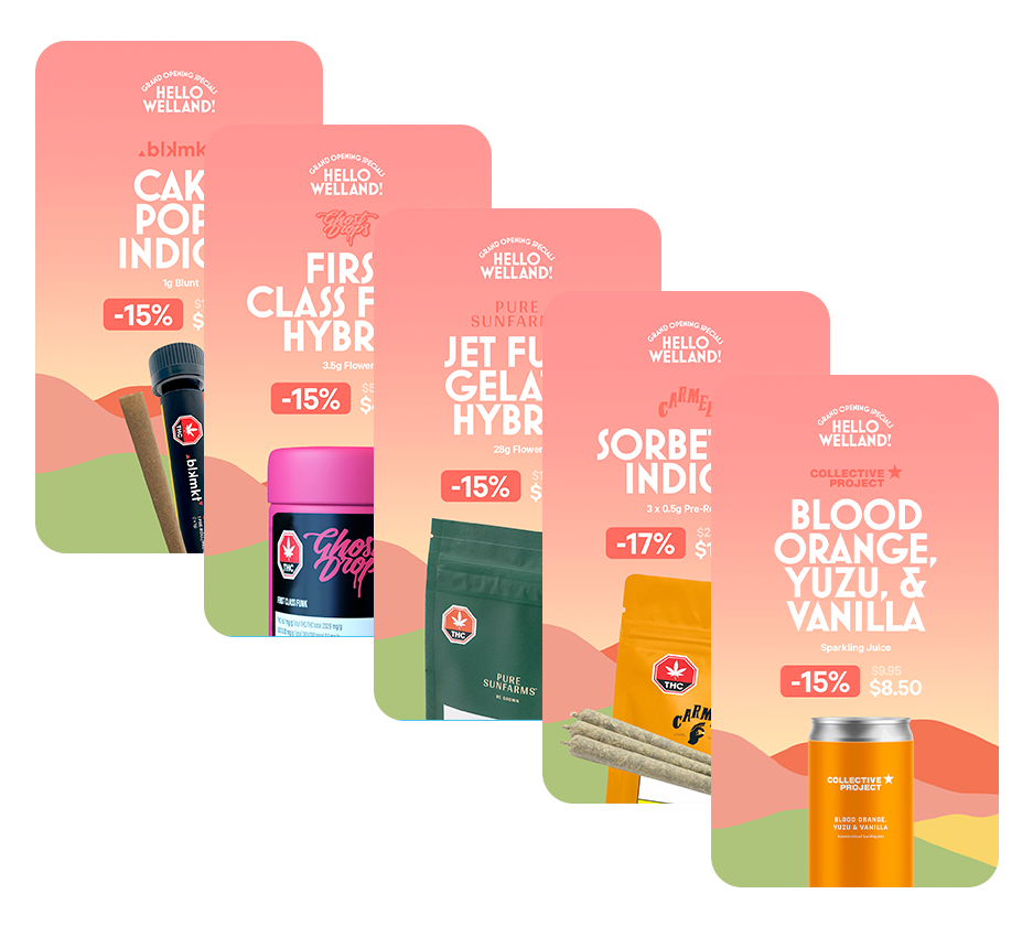
This format was also featured as part of our location 'opening events' to familiarize new customers with the weekly deal format. It was further expanded into other iterations outside of the rotating weekly deals to support our seasonal promotions.
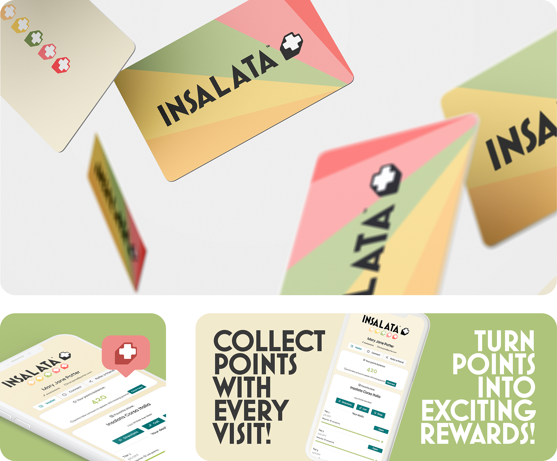
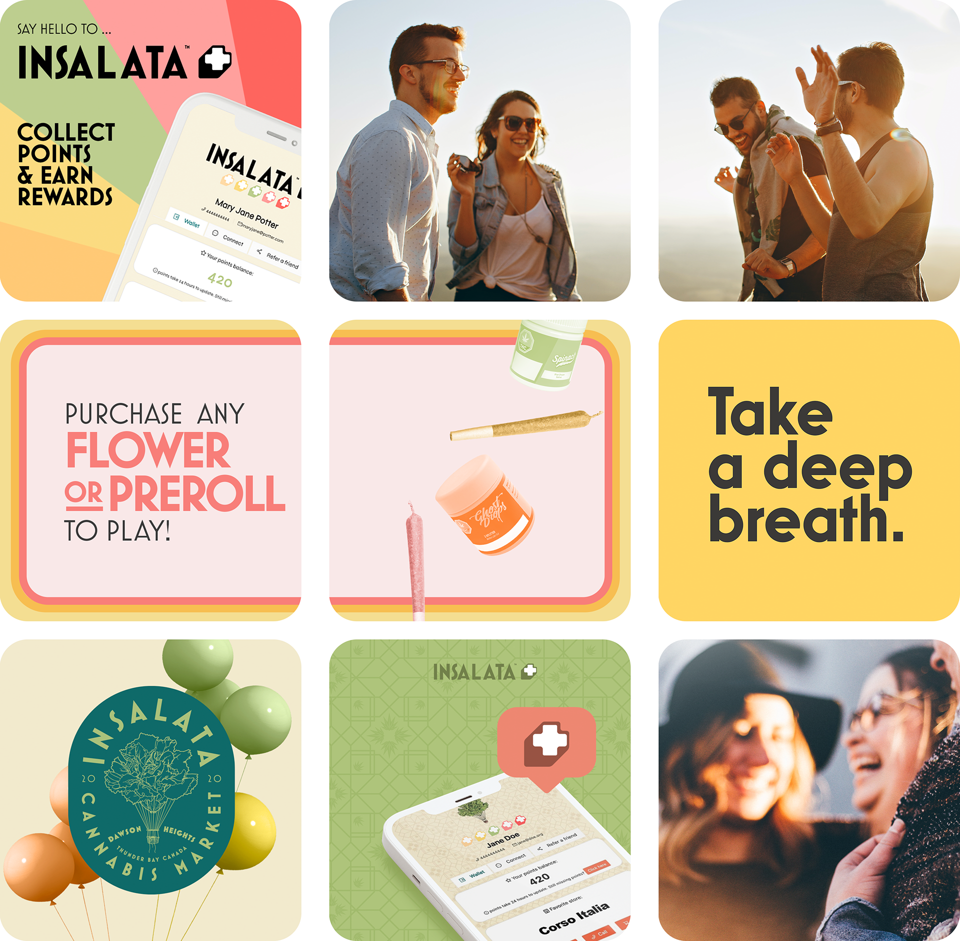
| Customer Membership Program: Insalata +
Our challenge was creating a loyalty program that feels like an exclusive club rather than a transactional chore. The goal was to redesign and relaunch the loyalty membership identity for Insalata+.
I led the end-to-end execution of the Insalata+ program, defining the visual identity, and core messaging of the refreshed program. The design language focuses on community, and "the exhale," shifting the conversation from simple points-gathering to an elevated return customer experience.
The program was a premium extension of the parent brand, using a modern, geometric typeface and a versatile color palette. Insalata+ successfully became a high-performing retention tool.
The program saw rapid adoption rates and a significant increase in return-visit frequency across all participating locations.
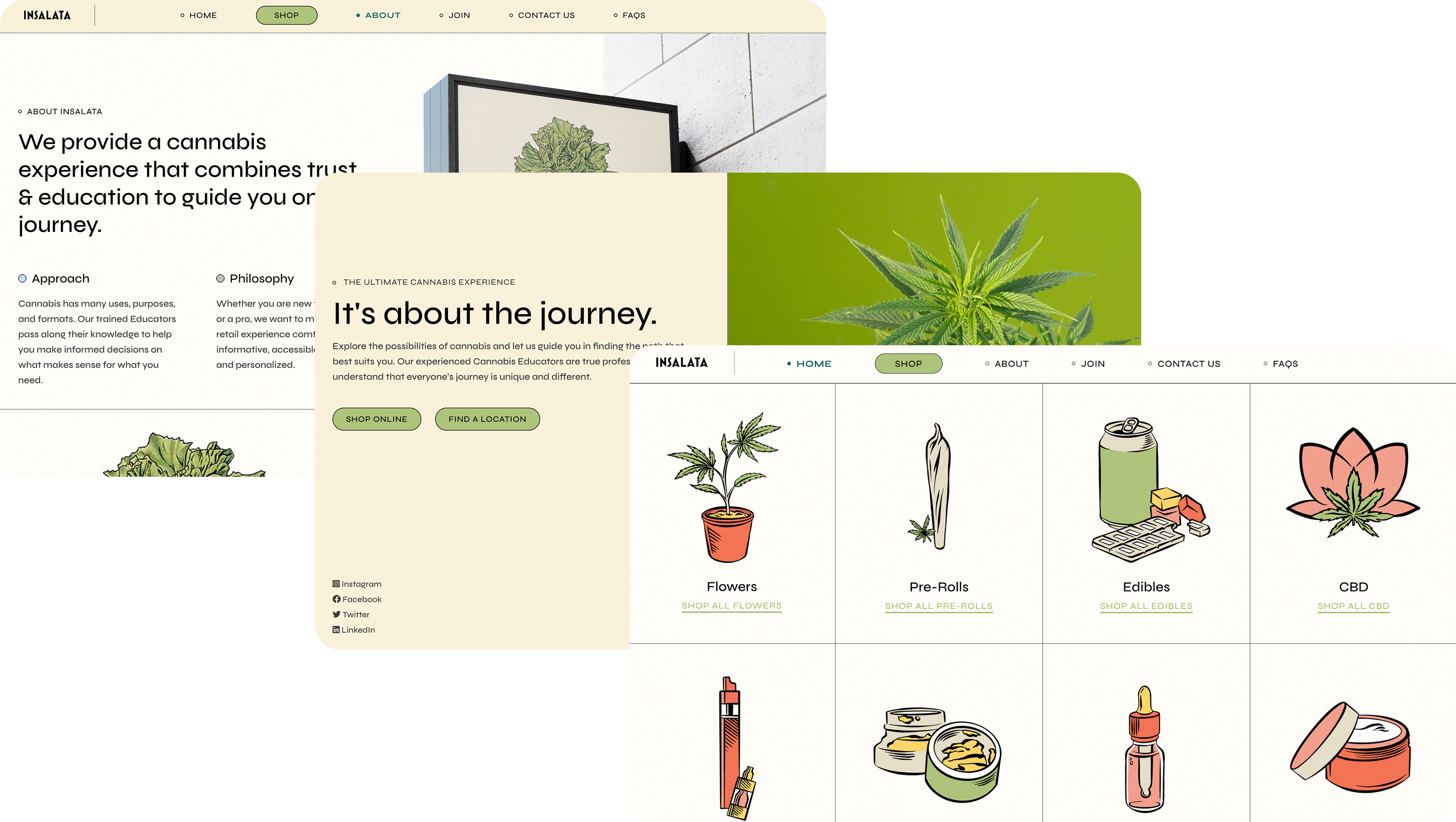
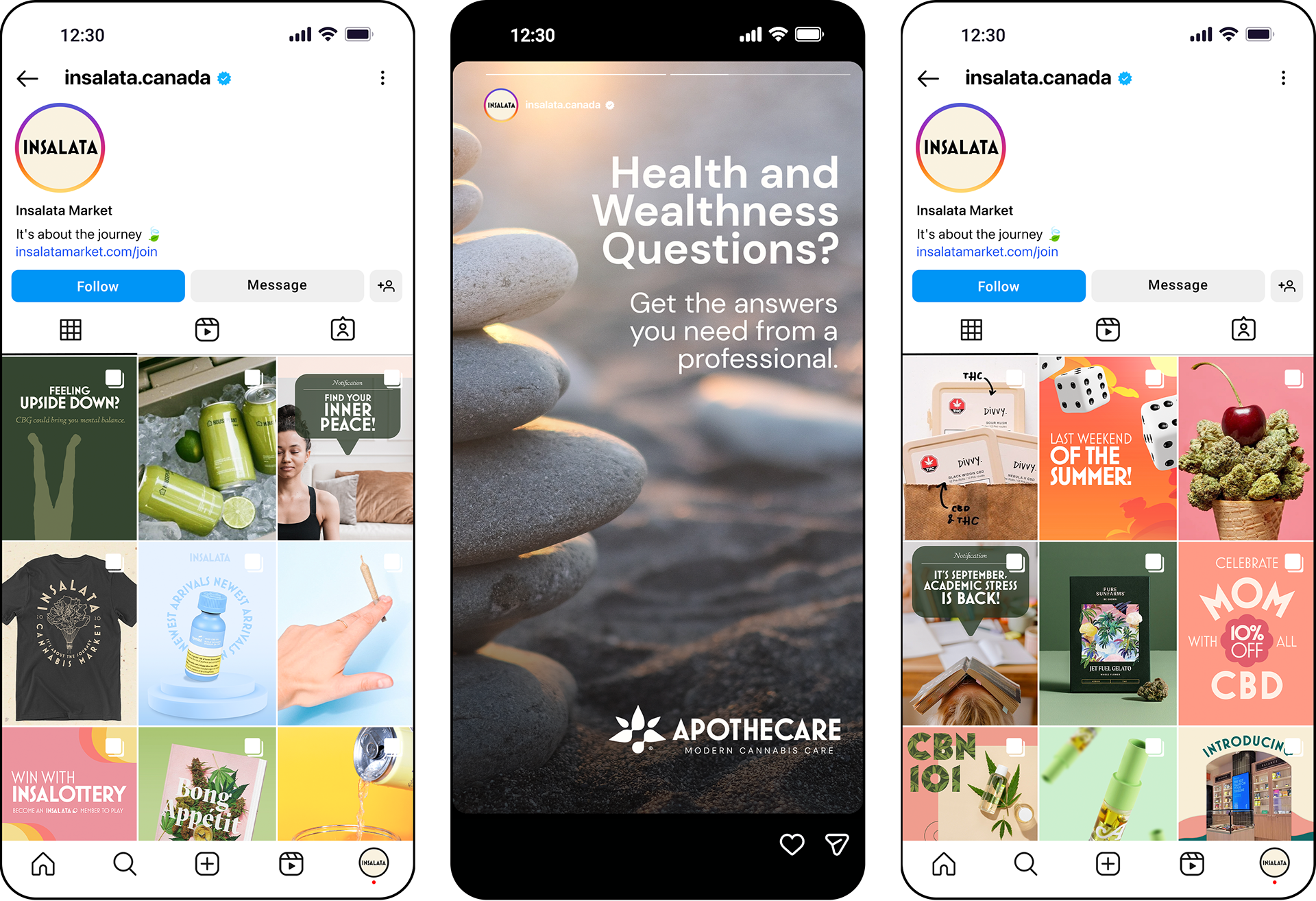
| Site Refresh and Alignment
The goal was to pivot the digital presence away from traditional industry tropes and toward a sophisticated, education-first wellness aesthetic. As this would be a page routinely visited by our online and pick-up customers, it became a crucial touch point to our new refined identity.
I led the design and layout strategy, focusing on a clean, editorial-style interface that prioritizes user journey and accessibility.
The result was a refined digital experience that aligned the site’s aesthetic with the premium nature of our dispensary in-store experience.
| Staff Portrait Photography
Because community was at the centre of our customer service strategy, we hoped to humanize our staff recommendations, reviews, and their overall product knowledge. To emphasize this I orchestrated a staff portrait session for each of our staff members. From managers, to pharmacists, to cashiers.

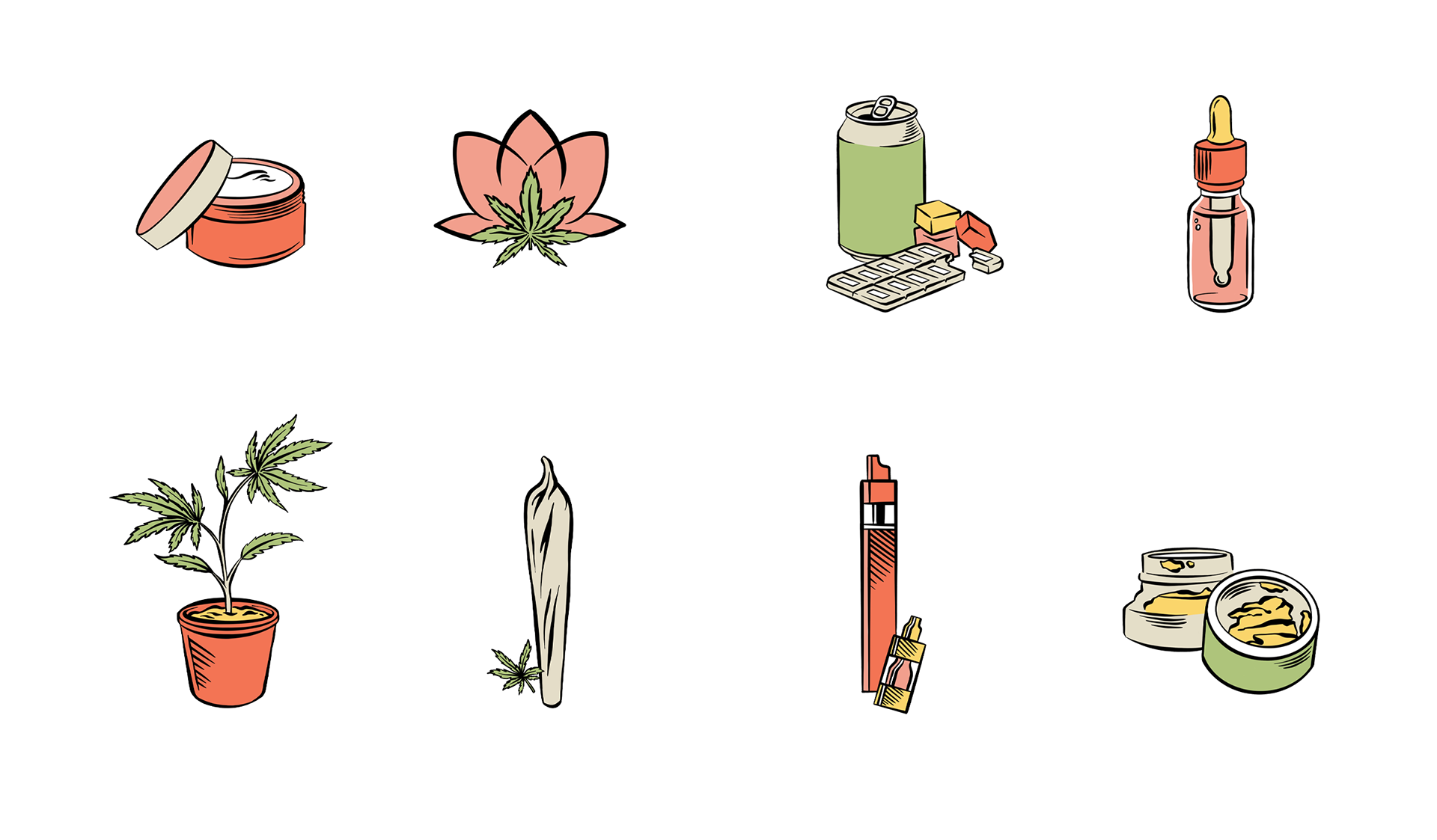
| Illustration Assets
To elevate the category navigation and entry to the online shopping portal, I designed a series of bespoke digital illustrations that replace standard product photography with a more curated, artisan feel.
Using a clean, technical line-weight, these icons provide a tactile "hand-drawn" quality that softens the digital interface. Each illustration was crafted to ensure instant recognition while maintaining a consistent visual language across the product catalogue using our brand colours.
By prioritizing these custom assets over stock imagery, the site achieves a unique, branded personality that feels high-end and intentional, reinforcing the "trust and education" at the heart of the customer journey.
| Social Media Content & Promotions
Collaborated with internal teams and content creators to plan and execute quarterly social media calendars. Did so under the strict guidelines of the Meta platforms terms and conditions.
Developed platform-specific strategies that translated core identities into engaging and visually exciting content. Ensured consistency in tone, colour systems, and composition across all social channels.
| Campaigns
Conceptualized and executed seasonal and promotional campaigns across regional and national markets. Campaign work spanned digital, social, and retail touch points. Each campaign was designed to be adaptable across multiple brands while maintaining distinct visual identities.
Please inquire for individual case studies regarding any of the below campaign titles.